 |
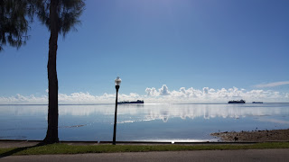
| I don't know what it is about this simple image but I find it appealing. It must be the fact that I took it while in a moving car. But I find the simplicity welcoming because no colors overwhelm each other and it looks nice to the eye. |
 |
Okay but let's just examine the elements of this image. It's simple, but there could be countless stories behind it! It's interesting how a single image is able to tell a tale, several depending on interpretations, and I think this image does the job. The moment I saw this sight, I knew I had to take a picture because think of all the stories it could tell!
The large shadow to the top there is somewhat distracting, but it could add to the whole storytelling aspect and is somewhat okay. |
 |
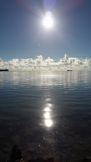
It's not quite there but the symmetry is very, very appealing to me. I also like the reflection of the sun in the water and all the glitter it leaves behind. Both the blue sky and blue water contrast each other nicely; one is simple with minimal colors, while the other holds many complex shades and tones beneath its surface. It's interesting!
The figures in the distance (the boats) are distractions and don't really belong. I don't like how you can't see their reflection either. |
 |
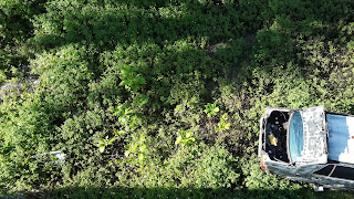
I got an image of them that wasn't blurry, which is an incredible feat! I also like how the gate is out of focus, and the main focus is the Max in between the gap. It sets some sort of midpoint, something at the center to capture our eyes first. I also laugh when I see this image and it makes me happy in general.
The shadows are distracting. The background is also unrelated and kind of ruins the image composition. I'll work on that. |
 |
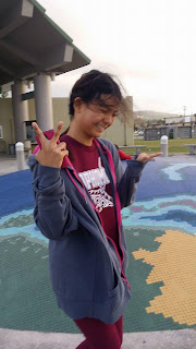
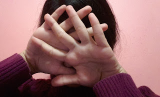
| I like how most of the image is all subtle shades of pink or purple. It sets a mood of embarrassment or bashfulness, and it matches me quite well, haha. I also particularly like how this image appears to be captured from below, which is an inside joke because I'm tall and insecure about my height, hahaha. (And people would have to look up to take a picture of me, usually.) Details, details. |
 |
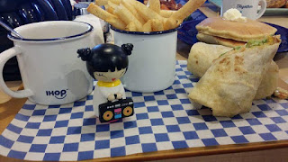
Blue and yellow, though they don't directly oppose each other on the color wheel, make this image particularly appeasing. Blue and yellow are the main shades you see, which is nice because it sets some sort of consistency. I also really like this image because it has good food in it.
The items don't look organized and there is no particular focus that captures the eye. |
"What did you take away from this online course?"
For the Rule of Thirds photo project, I turned on the gridlines function on my camera so that it could help me out some, and I never disabled the function because it actually helps me take photos! I see the rule everywhere now, and when I take a photo, I consider if I want to follow the rule or not. It gives me something to think about and helps me compose an image. I also consider the color element of photography, and since I'm such a picky person for color, it helps me determine which items look best together in a photo.
I'm so glad I took this course! It's taught me so, so much about photography that I never knew, and now I get to brag to people about my new knowledge. Though I'm not really interested in a career in photography, I still want to pursue it as a hobby, and thanks to this course, I get to do so with more ease. I'm comfortable taking photos now because I can judge it and do what I can to compose it in a way that makes it even better. I learned so many rules, elements, and techniques that I think are pretty essential to good photography. This has been a great summer course!


